Showing posts with label Best Practices. Show all posts

Monday, November 16, 2015

Work in Progress

Now that we are into the second half of the first semester of this school year, I am in the process of reviewing my e-courses on Canvas and evaluating those sections that had a rough initial start of of some elements of this new (to me) LMS.

There are 3 goals for major change of my courses I want tackle before the beginning of the Spring
https://www.flickr.com/photos/dullhunk/2101058680
semester:
  1.  First contact email sent to students at the time of their enrollment with the first directions for the access to the course and link to the introduction of the course video. Although it is not  specific component of the course, this email is very critical since I can send it to students and their parents/guardians, allowing all of them to have a first taste and feel for the course. Parents/guardians are not yet able to access to my Canvas courses with an observer account - this might change next year - so this first video will allow parents/guardians to have an understanding of what the course is about right away.
    I think that this piece of information will allow parents more understanding of the learning environment of their kids and will empower them in asking the right question to the students whenever they want to know more about their progress.
    I am also considering the option of creating a video specific for parents/guardian for guiding them through the course and show them how and where they can monitor the progress, activity and score of their kids in the course, as well as seeing my feedback to their work. This idea is becoming more relevant due to a feature present in Canvas: the "what if..." option in the grade book. Students indeed can use this feature for changing their grades (not on the actual grade-book) and see what they would need to score in a particular assignment for changing their final grade. Great feature, right? Well, recently I was told of a parent who was completely blown way when she realized that he son was lying to her and showing her the "what if" grades instead of the actual scores of his work. The discrepancy between the reports shown by he student and the concerned emails from a teacher moved the parent to call our office for figuring out what was going on. It was just then, when the parent was able to access to the course and go to the grade-book that realized that something was very wrong and that what she was seeing at that moment was far different from what she was shown regularly by her child.
    Now, this episode is pretty iconic of how great tools can be used in the wrong way and you never know what to expect!
  2. Redesign the first section of the course for being more user friendly and making sure that all the important information are provided to students. This process will include the remake of the navigation video and the use of Google Docs as repository of content shared by multiple courses, such as the students tools.
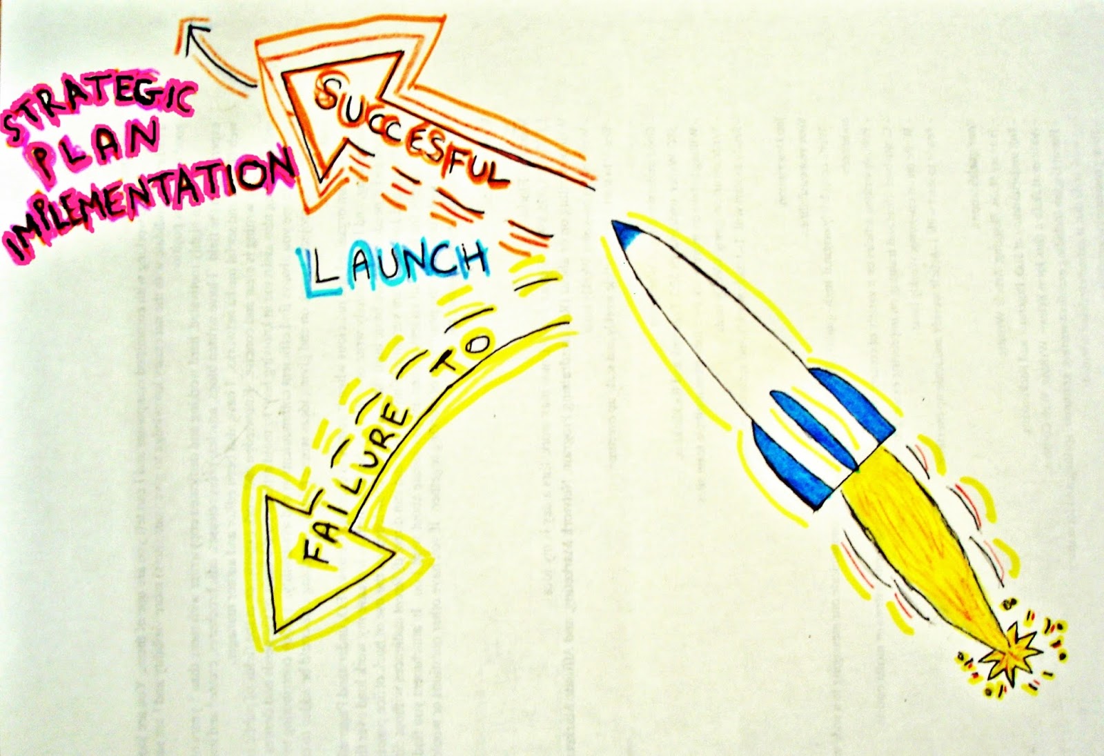
    This goal is very important to me especially considering the major failure to launch I had with the Fall semester. I have made a list of all the possible things that could go wrong - not that I can be 100% positive that nothing else will pop-up, but at least I can beat the odds! I have been researching various Canvas sites for gaining more ideas of functional and well designed courses to use as models.
    Something that I would like to keep on target is the accessibility of the site especially to hearing and vision impaired students. This is certainly a great challenge because often it conflict with my creativity drive. Finding the right balance between functionality, accessibility, and aesthetic is definitely challenging, but it is something I want and need to address since I would like to have my courses being accessible to all our students. Last year for the first time I have seen the tool used by a blind student for navigating the Internet, and that experience was a wake-up call for the code barriers we create in our e-courses when we start paying with fonts, colors, and all the very cool visual effects.
    I am planning to have one of our district vision specialist to test my courses for accessibility, and I would like to have a few students testing my spring courses for user-friendliness during the Christmas break.
  3. Review my assessment program. This will benefit my students and also myself in the way that at this time I have a graded task with need or re-grading almost every day, which times 120 students makes my life a nightmare! I am sure that there must be a better way to assess my students. I really want to look into how to streamline my assessment program for making it more relevant to students and less grading-intensive.

Friday, October 23, 2015

Planning an effective introductory to the course video

The first rule should be "put yourself in the students' shoes". This is a mistake that unfortunately comes easier that not when you spend a lot of time creating and developing a course. You know the course inside-out and this familiarity with its structure can make you underestimate some of the challenges or some of the "unexpected" and not successful ways students could move in the course getting confused and frustrated.

Retrieved from
https://luna12780.files.wordpress.com/2010/04/failure-to-launch.jpg
When I designed my course I did this, and I have followed the steps students should take in the first video I made, however something that I did not consider was the starting point from where a student access to the course. I gave for granted that the starting point was the homepage of the course, while it is not. In the page where students arrive when they log in, is a general Canvas entry page that at this time does not show the list of the courses the student is enrolled in, but students need to click on a tab "Courses and Groups" for opening a drop down menu with the list of the courses/course in which they are enrolled. Then clicking on the name of the course they do arrive to the home page.
In the entry page though students see two lists: "to do" and "coming up".
The first list shows a partial list of assignments already due. This is particularly challenging for students who are enrolling in the course after the beginning of the course, and it happens very often. This list as I said does show assignments graded, however some assignments that have embedded content do not show in this list. Also anything that needs to read, watched, listen, does not show unless is linked to a grade.
The list coming up shows only assignments graded that are coming up in the calendar.

Before the beginning of the course, when the course was not populated, I did not see the presence of the list "to do". This has been a very misleading section that made students click directly on those assignments without accessing to the homepage and following through with the course. Since I did not foresee this issue, my original video did not include any direction for the entry page, while now I am aware of the importance of that first step for avoiding a huge sidetracking of students.

Another think that is overestimate is the fact that students will read directions :) For this reason in my video I had to add a couple of directions for finding some essential tools or the course: one is a video with the directions for typing accented letters on a keyboard, and how to use Microsoft Lync, a chatting tool that is already installed on all computers of our school district. While the former is a tool for students work, the other is their tool for connecting with me directly. Both tools are very important.

An overall good strategy for creating an introductory video should include:
  • Make a plan of the flow of the course: from where students enter to where they should go to.
  • Consider any possible deviation from he flow and alert students of the risks in taking those paths. 
  • Identify and introduce students to icons connected to particular elements of the course, so that they could recognize them later instead of guessing.
  • Make a list of the important elements students should know right from the beginning, contacts with the instructor, how to see grades, how to see teacher's comments, where to see the due dates, where to see announcements, etc...
  • If you can, TEST IT with someone who is not familiar with your course, a colleague would work, the effectiveness of your video in his/her ability to access to the course and move through following the path you planned. 
The tool I use for creating my video is Camtasia Studio. It takes a little longer than using some of the more immediate tools, but it also offers great editing capabilities, so that the final product can be of a good quality.
Unfortunately I was not able to finalize the new video today for some technical difficulties, but I hope I will be bale to publish it here tomorrow.  

Monday, October 19, 2015

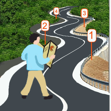
Everyone needs a road-map!


This is even more important when we are talking about online courses. Over the years teaching online I have found how important is to give students right at the very first contact an effective and user friendly tool that takes them exactly where they need to go in the course and that shows them around the course as a good hostess.

Thinking about it seems a pretty logical tah! idea, right? The challenge is making an EFFECTIVE introduction video!
This process takes quite some time, effort and definitely a few failures to launch. After working on Moodle for 5 yeas I thought I had my intro video pretty much nailed down to perfection. I was so proud of it. This year though with the adoption of the new (for me) LMS Canvas I had to remake all my introductory video on a LMS I was not very familiar with, so I am back dealing with my first "failure to launch" Canvas' road-map.

It is amazing how many things I learn in the first 48 hours of the school years, when the floodgate is open and students are pouring into the courses. That's when you find out a lot of the things that can go wrong! This time around though there was a particular step that I totally underestimated and that has proved to be critical in the misguidance of students arriving to the course. I had some great conversations with some of my colleagues at the Distance Learning department, and we are planning to put our hands back on the video and create some guidelines for all our intro to the course videos so that students enrolled in any of our courses would find some sort of consistency in the navigation.


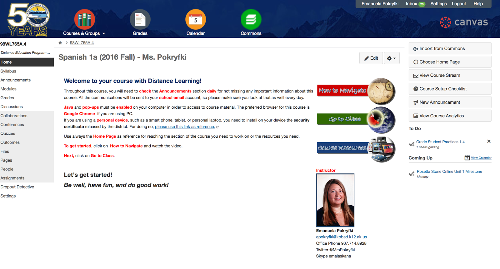
This is my first Canvas intro video and the Home Page shown here actually has been already restyled reducing the size of the 3 buttons, placing them on the right of the welcoming message, and adding my photo and contact info right under the buttons, as you can see in this image on the right.
I am not yet 100% satisfied with the layout of my home page, however this organization did not cause any troubles, while the video did, and this is why I would like to start tacking that first.

I would greatly appreciate any constructive criticism about the video and if you have 2 cents also for the home page, feel free to throw them here as well :)

Next step: listing problem caused by the current video and then start planning the new video!